ညီမကတော့ Spiceworks Myanmar company မှာ Web Designer အဖြစ်ဝင်ရောက်လုပ်ကိုင်နေတဲ့ မဆုရည်ထွန်း ဖြစ်ပါတယ်။ ပြီးခဲ့တဲ့ တစ်ခေါက်က
1. Browser Define
2. CSS transition
3. RGBA background
4. Border radius
5. @font-Face
စတဲ့အကြောင်းအရာတွေနဲ့ပတ်သက်ပြီး ညီမသိသလောက် sharing လုပ်ပေးခဲ့ပါတယ်။
ဒီတစ်ပတ်မှာလဲ Web Developerနှင့် Web Designer တွေအတွက် CSS coding ရေးရာမှာ အထောက်ကူဖြစ်စေမယ့် CSS coding knowledge လေးတွေကိုညီမလေ့လာထားသလောက်လေး ထပ်ပြီး sharing လုပ်ပေးချင်ပါတယ်။
ကျန်တဲ့ CSS3 အကြောင်းအရာ ၅ခု ဖြစ်တဲ့
6. CSS gradient
7. Text Rotate
8. CSS animation
9. Text shadow
10. Box shadow နဲ့ ပတ်သက်ပြီးပြောသွားမှာဖြစ်ပါတယ်။
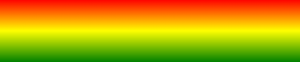
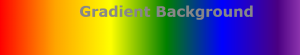
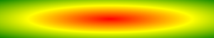
6.CSS3 Gradient
CSS Gradient ကတော့ color တွေ ကို only css coding သုံးပြီး အရောင်တွေကိုရောစပ်အသုံးပြုချင်တဲ့အချိန်မှာ အသုံးဝင်ပါတယ်။CSS Gradient ကိုအဓိက အသုံးပြုရတဲ့ ရည်ရွယ်ချက်ကတော့ download time and bandwidth usage ကို လျှော့ချချင်လို့ ဖြစ်ပါတယ်။
6.1 How to use CSS3 Gradient
CSS3 Gradient ကို
- Linear Gradients (goes down/up/left/right/diagonally)
- Radial Gradients (defined by their center)
ဆိုပြီး နှစ်မျိူးခွဲနိုင်ပါတယ်။
6.2 CSS3 Linear Gradients
CSS3 Linear Gradient သတ်မှတ်ရန် အနည်းဆုံး color stops နှစ်ခုသတ်မှတ်ပေးရမှာဖြစ်ပါတယ်။
Syntax:
background: linear-gradient(direction, color-stop1, color-stop2, ...);
6.2.1 Linear Gradient – Top to Bottom (this is default)
#grad {
background: red; /* For browsers that do not support gradients */
background: -webkit-linear-gradient(red, yellow); /* For Safari 5.1 to 6.0 */
background: -o-linear-gradient(red, yellow); /* For Opera 11.1 to 12.0 */
background: -moz-linear-gradient(red, yellow); /* For Firefox 3.6 to 15 */
background: linear-gradient(red, yellow); /* Standard syntax */
}

6.2.2 Linear Gradient – Left to Right
#grad {
background: red; /* For browsers that do not support gradients */
background: -webkit-linear-gradient(left, red , yellow); /* For Safari 5.1 to 6.0 */
background: -o-linear-gradient(right, red, yellow); /* For Opera 11.1 to 12.0 */
background: -moz-linear-gradient(right, red, yellow); /* For Firefox 3.6 to 15 */
background: linear-gradient(to right, red , yellow); /* Standard syntax */
}

6.2.3 Linear Gradient – Diagonal
#grad {
  background: red; /* For browsers that do not support gradients */
  background: -webkit-linear-gradient(left top, red, yellow); /* For Safari 5.1 to 6.0 */
  background: -o-linear-gradient(bottom right, red, yellow); /* For Opera 11.1 to 12.0 */
  background: -moz-linear-gradient(bottom right, red, yellow); /* For Firefox 3.6 to 15 */
  background: linear-gradient(to bottom right, red, yellow); /* Standard syntax */
}

6.2.4 Linear Gradient – Using Angle
Syntax:
background: linear-gradient(angle, color-stop1, color-stop2);
#grad {
  background: red; /* For browsers that do not support gradients */
  background: -webkit-linear-gradient(-90deg, red, yellow); /* For Safari 5.1 to 6.0 */
  background: -o-linear-gradient(-90deg, red, yellow); /* For Opera 11.1 to 12.0 */
  background: -moz-linear-gradient(-90deg, red, yellow); /* For Firefox 3.6 to 15 */
  background: linear-gradient(-90deg, red, yellow); /* Standard syntax */
}

6.2.5 Linear Gradient – Using Multiple color stops(top to bottom is default)
#grad {
  background: red; /* For browsers that do not support gradients */
  background: -webkit-linear-gradient(red, yellow, green);
  background: -o-linear-gradient(red, yellow, green);
  background: -moz-linear-gradient(red, yellow, green);
  background: linear-gradient(red, yellow, green);
}
6.2.6 Linear Gradient – Using Multiple color stops
#grad {
  background: red;
  background: -webkit-linear-gradient(left,red,orange,yellow,green,blue,indigo,violet);

  background: -o-linear-gradient(left,red,orange,yellow,green,blue,indigo,violet);

  background: -moz-linear-gradient(left,red,orange,yellow,green,blue,indigo,violet);

  background: linear-gradient(to right, red,orange,yellow,green,blue,indigo,violet);
}
6.2.7 Linear Gradient – Using Transparency
color တွေကို blur effect နဲ့ တွဲသုံးချင်ရင် အရှေ့မှာပြောခဲ့တဲ့ rgba() နဲ့ တွဲသုံးရမှာပါ။
#grad {
  background: red; /* For browsers that do not support gradients */
  background: -webkit-linear-gradient(left,rgba(255,0,0,0),rgba(255,0,0,1));

  background: -o-linear-gradient(right,rgba(255,0,0,0),rgba(255,0,0,1));

  background: -moz-linear-gradient(right,rgba(255,0,0,0),rgba(255,0,0,1));

  background: linear-gradient(to right, rgba(255,0,0,0), rgba(255,0,0,1));
}
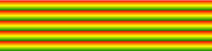
6.2.8 Linear Gradient – Repeating a linear-gradient
#grad {
  background: red; /* For browsers that do not support gradients */
  background: -webkit-repeating-linear-gradient(red, yellow 10%, green 20%);

  background: -o-repeating-linear-gradient(red, yellow 10%, green 20%);

  background: -moz-repeating-linear-gradient(red, yellow 10%, green 20%);

  background: repeating-linear-gradient(red, yellow 10%, green 20%);
}
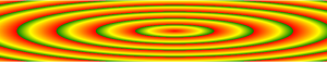
6.3 CSS3 Radial Gradients
Syntax:
background: radial-gradient(shape size at position, start-color, ..., last-color);
6.3.1 Radial Gradient – Repeating a linear-gradient
#grad {
  background: red; /* For browsers that do not support gradients */
  background: -webkit-radial-gradient(red, yellow, green);

  background: -o-radial-gradient(red, yellow, green);

  background: -moz-radial-gradient(red, yellow, green);

  background: radial-gradient(red, yellow, green);

}
6.3.2 Radial Gradient – Differently Spaced Color Stops
#grad {
  background: red; /* For browsers that do not support gradients */
  background: -webkit-radial-gradient(red 5%, yellow 15%, green 60%);

  background: -o-radial-gradient(red 5%, yellow 15%, green 60%);

  background: -moz-radial-gradient(red 5%, yellow 15%, green 60%);

  background: radial-gradient(red 5%, yellow 15%, green 60%);
}

6.3.3 Radial Gradient – Set Shapes
Radial Gradient မှာ Shade ပုံစံ ကိုလဲ define လုပ်နိုင်ပါတယ်။
- ellipse
- circle
ဆိုပြီးနှစ်ခုရှိပါတယ်။ellipse က တော့ default ဖြစ်မှာပါ။ Example မှာတော့ circle ကို နမူနာရေးပြထားပါတယ်။ellipseကတော့ default ဖြစ်လို့ ကိုယ်တိုင်စမ်းကြည့်ပါနော်။
#grad {
  background: red; /* For browsers that do not support gradients */
  background: -webkit-radial-gradient(circle, red, yellow, green);

  background: -o-radial-gradient(circle, red, yellow, green);

  background: -moz-radial-gradient(circle, red, yellow, green);

  background: radial-gradient(circle, red, yellow, green);
}
6.3.4 Radial Gradient – Use of Different Size Keywords
The size parameter defines the size of the gradient. It can take four values:
- closest-side
- farthest-side
- closest-corner
- farthest-corner
#grad1 {
  background: red; /* For browsers that do not support gradients */

  background: -webkit-radial-gradient(60% 55%, closest-side, red, yellow, black);

  background: -o-radial-gradient(60% 55%, closest-side, red, yellow, black);

  background: -moz-radial-gradient(60% 55%, closest-side, red, yellow, black);

  background: radial-gradient(closest-side at 60% 55%, red, yellow, black);
}

#grad2 {
  background: -webkit-radial-gradient(60% 55%, farthest-side, red, yellow, black);

  background: -o-radial-gradient(60% 55%, farthest-side, red, yellow, black);

  background: -moz-radial-gradient(60% 55%, farthest-side, red, yellow, black);

  background: radial-gradient(farthest-side at 60% 55%, red, yellow, black);
}
closest-side နဲ့ farthest-side ကို sample css code ရေးပြထားပေးတယ်နော်။ဘယ်လိုပုံစံလေး ပြောင်းလဲသွားမလဲ နောက်ထပ် keywords တွေပါထည့်သုံးပီးစမ်းကြည့်ပေးပါနော်။
6.3.5 Repeating a radial-gradient
#grad {
  background: red; /* For browsers that do not support gradients */

  background: -webkit-repeating-radial-gradient(red, yellow 10%, green 15%);

  background: -o-repeating-radial-gradient(red, yellow 10%, green 15%);

  background: -moz-repeating-radial-gradient(red, yellow 10%, green 15%);

  background: repeating-radial-gradient(red, yellow 10%, green 15%);
}
7.CSS3 Text Rotation
CSS3 မှာ text တွေကိုလဲ စိတ်တိုင်းကျ rotate လုပ်နိုင်ပါတယ်။ Rotate လုပ်မယ်ဆိုရင် CSS3 Transform ကိုအသုံးပြုရမှာဖြစ်ပါတယ်။ကိုယ် ပြောင်းချင်သလို degree သုံးပြီးပြောင်းလို့ရပါတယ်။
Example:
.txt_rotate1 {
    -webkit-transform: rotate(180deg);
    -moz-transform: rotate(180deg);
    -o-transform: rotate(180deg);
    writing-mode: rl-tb;
}
.h1 {
-webkit-transform: rotate(90deg);
-moz-transform: rotate(90deg);
-o-transform: rotate(90deg);
writing-mode: lr-tb;
}

8.CSS3 Animation
CSS3 Animation ကေတော့ Web Developer တွေနဲ့ designer တွေ အတွက် အရမ်းအသုံးဝင်ပါတယ်။HTML Element တွေကို JavaScript or Flashမသုံးပဲနဲ့ animation တွေပြုလုပ်နိုင်မှာဖြစ်ပါတယ်။
8.1 CSS3 Animation တွေဘယ်လို အသုံးပြုကျမလဲ?
CSS3 Animation သုံးမယ်ဆိုရင်
- some keyframes တွေကိုသတ်မှတ်ပေးရပါမယ်။
- keyframe က ကိုယ် animation လုပ်ချင်တဲ့ style element တွေကို အလုပ်လုပ်ပေးမှာဖြစ်ပါတယ်။
သတိထားရမှာကတော့ Default အနေနဲ့ Animation duation က 0 ဖြစ်တဲ့အတွက် animation ကိုဘယ်အချိန်ထိလုပ်စေချင်တာလဲဆိုတဲ့ animation duration property ကို သတ်မှတ်ပေးရမှာဖြစ်ပါတယ်။
Animation အတွက် keyframes သတ်မှတ် ပေးရမယ်ဆိုတော့ Keyframes rule တွေရှိပါတယ်။
Animation အလုပ်လုပ်ဖို့အတွက် animation နဲ့ style element တွေကို ချိတ်ပေးရမှာပါ။ အဲ့လိုချိတ်တဲ့ အလုပ်ကို Keyframes က လုပ်ဆောင်ပေးတာဖြစ်ပါတယ်။
Example:
@keyframes example {
    from {background-color: red;}
    to {background-color: yellow;}
}
div {
width: 100px;
height: 100px;
background-color: red;
animation-name: example;
animation-duration: 4s;
}
Example အရ animation-name က exampleဖြစ်တဲ့အတွက် @keyframes ရဲ့ နာမည်ကလဲ exampleဖြစ်နေရပါမယ်။
Note: animation-name နဲ့ @keyframes name က တူနေရပါမယ်။
8.2 Delay an Animation
Animation တစ်ခု ဖန်တီးလျှင် animation-delay properties သတ်မှတ်ပေးဖို့ လိုအပ်ပါတယ်။
div {
width: 100px;
height: 100px;
position: relative;
background-color: red;
animation-name: example;
animation-duration: 4s;
animation-delay: 2s;
}
8.3 Set How Many Times an Animation Should Run
Animation တစ်ခု ဖန်တီးလျှင် animation အကြိမ်အရေအတွက်ကိုလဲ ကိုယ့်စိတ်တိုင်းကျသတ်မှတ်ပေးနိူင်ပါတယ်။
div {
width: 100px;
height: 100px;
position: relative;
background-color: red;
animation-name: example;
animation-duration: 4s;
animation-delay: 2s;
animation-iteration-count:3;
}
Example အရ animation-iteration-count:3 ကြိမ်ပေးထားတဲ့အတွက် animation က 3 ကြိမ် အလုပ်လုပ်မှာဖြစ်ပါတယ်။
8.4 Animation Direction
ကိုယ်ဖန်တီးလိုက်တဲ့ Animation ရဲ့ direction ကိုလဲ သတ်မှတ်လို့ရပါသေးတယ်။
The animation-direction ကတော့အောက်ပါအတိုင်း keyword တွေရှိပါတယ်။
-
- normal – The animation is played as normal (forwards). This is default
- reverse – The animation is played in reverse direction (backwards)
- alternate – The animation is played forwards first, then backwards
- alternate-reverse – The animation is played backwards first, then forwards
div {
width: 100px;
height: 100px;
position: relative;
background-color: red;
animation-name: example;
animation-duration: 4s;
animation-delay: 2s;
animation-direction: reverse;
}
Example အရ animation-direction ကို reverse ပေးထားတဲ့အတွက် ကိုယ်သတ်မှတ်ထားတဲ့ animation value တွေက ပြောင်းပြန်အလုပ်လုပ်သွားမှာဖြစ်ပါတယ်။
8.5 Specify the Speed Curve of the Animation
CSS3 Transition တုန်းကလိုပဲ timing-function ကို သတ်မှတ်ပေးလို့ရပါတယ်။
The transition-timing-function property can have the following values:
-
-
- ease – specifies a transition effect with a slow start, then fast, then end slowly (this is default)
- linear – specifies a transition effect with the same speed from start to end
- ease-out – specifies a transition effect with a slow end
- ease-in-out – specifies a transition effect with a slow start and end
- cubic-bezier(n,n,n,n) – lets you define your own values in a cubic-bezier function
-
8.6Animation Shorthand Property
CSS3 transition properties can be specified one by one, like this:
div {
animation-name: example;
animation-duration: 5s;
animation-timing-function: linear;
animation-delay: 2s;
animation-iteration-count: infinite;
animation-direction: alternate;
}
or by using the shortand property transition
div {
animation: example 5s linear 2s infinite alternate;
}
9.CSS3 Text Shadow
The CSS3 text-shadow property applie shadow to text.
9.1 How to Use Text Shadow
In its simplest use, you only specify the horizontal shadow and the vertical shadow.
h1 {
text-shadow: 2px 2px;
}
9.2 Text Shadow With Color And Blur Effect
h1 {
 text-shadow: 2px 2px 5px red;
}
9.3 Multiple Shadows
h1 {
 text-shadow: 0 0 3px #FF0000, 0 0 5px #0000FF;
}
h1 {
 color: white;
 text-shadow: 1px 1px 2px black, 0 0 25px blue, 0 0 5px darkblue;
}
10.CSS3 Box Shadow
The box-shadow property attaches one or more shadows to an element.
10.1 How to Use Box Shadow
In its simplest use, you only specify the horizontal shadow and the vertical shadow.
div {
box-shadow: 10px 10px;
}
10.2 Box Shadow With Color And Blur Effect
div {
box-shadow: 10px 10px 5px grey;
}
CSS3 နဲ့ ပတ်သက်ပြီး ညီမသိသလောက် ပြောပြပေးသွားတာဖြစ်ပါတယ်။
https://www.toptal.com/developers/css3maker
http://www.w3school.com/css
ညီမလေ့လာတဲ့ Web Site link ကိုလဲပြောပြပေးထားပါတယ်။
ညီမကိုယ်တိုင်လဲလေ့လာနေဆဲမို့CSS3 လေ့လာတဲ့ လူတွေ အခက်အခဲ မရှိလေ့လာနိုင်အောင် တစ်ထောင့်တစ်နေရာက အကူညီရနိုင်မယ်လို့ မျှော်လင့်ပါတယ်။
နောက်ထပ်လဲ လေ့လာဖြစ်တာလေးတွေ Sharing လုပ်ပေးသွားပါ့မယ်နော်။
အားလုံးကို ကျေးဇူးတင်ပါတယ်ရှင့်။
