အားလုံးပဲ မင်္ဂလာပါရှင့်။
ညီမကတော့ Spiceworks Myanmar မှာ Web Designer အနေနဲ့ ဝင်ရောက်လုပ်ကိုင်နေတဲ့ ခင်ရတနာအောင် ဖြစ်ပါတယ်ရှင့်။ ဒီတစ်ပတ် ညီမ မျှဝေပေးချင်တဲ့ အကြောင်းအရာကတော့ Flexbox property အကြောင်း ဖြစ်ပါတယ်။
Flexbox property တွေကို အသုံးပြုမယ်ဆို display: flex; ဆိုပြီး အရင်ကြေညာရပါမယ်။
flex-wrap property မှာ wrap နဲ့ nowrap ဆိုပြီး value တွေ ရှိပါတယ်။ flex-wrap: nowrap; ဆိုပြီး အသုံးပြုမယ်ဆို component တွေကို line တစ်ခုပေါ်မှာဘဲ ဆန့်အောင် နေရာချထားမှာ ဖြစ်ပါတယ်။
flex-wrap: warp; ဆိုရင်တော့ component တွေရဲ့ width/height အတိုင်း နေရာယူပြီး one line နဲ့ နေရာမလောက်တော့တဲ့အချိန်မှာ အောက်တစ်ကြောင်း ဆင်းသွားမှာ ဖြစ်ပါတယ်။

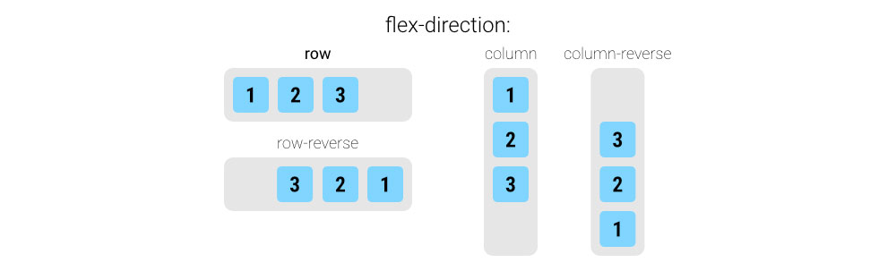
flex-direction ကတော့ component တွေကို horizontally နေရာချမလား၊ vertically နေရာချမလား သတ်မှတ်တဲ့အချိန်မှာ အသုံးပြုပါတယ်။ component တွေကို horizontally နေရာချမယ်ဆိုရင် flex-direction: row; ကို အသုံးပြုပြီး vertically နေရာချမယ်ဆိုရင်တော့ flex-direction: column; ကို အသုံးပြုပါတယ်။ flex-direction မှာ row, column အပြင် row-reverse, column-reverse ဆိုပြီး အသုံးပြုလို့ ရပါတယ်။ row-reverse မှာ component တွေကို right to left နေရာချထားပြီး column-reverse မှာဆိုရင်တော့ component တွေကို bottom to top နေရာချထားပါတယ်။
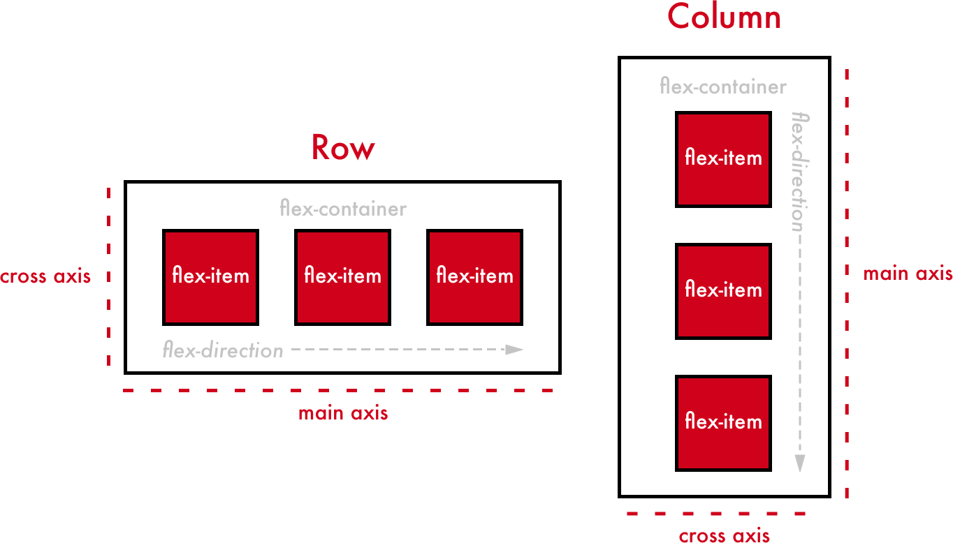
နောက်ပိုင်းရှင်းပြမယ့် properties ထဲမှာ cross-axis ကို အသုံးပြုရှင်းပြမှာဖြစ်လို့ flex-direction နဲ့ တွဲပြီး main-axis နဲ့ cross-axis ကို ရှင်းပြချင်ပါတယ်။ flex-direction ကို row ပေးထားမယ်ဆိုရင် သူ့ရဲ့ cross-axis က column ဖြစ်ပါတယ်။ ထို့အတူ flex-direction ကို column ပေးမယ်ဆိုရင် cross-axis က row ဖြစ်ပါတယ်။
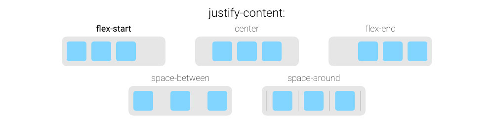
justify-content ကတော့ parent component ရဲ့ extra space ပေါ်မှာ မူတည်ပြီး component တွေကို နေရာချထားပါတယ်။ justify-content ရဲ့ flex-start, flex-end, center, space-between, space-around နဲ့ space-evenly စတဲ့ value တွေကို အသုံးပြုလို့ ရပါတယ်။
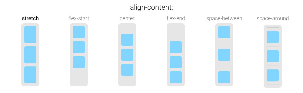
align-content ကတော့ justify-content လိုဘဲ flex-start, flex-end, center, space-between, space-around နဲ့ space-evenly ဆိုတဲ့ value တွေ ရှိပါတယ်။ ဒါပေမယ့် အလုပ်လုပ်ပုံချင်း ကွာခြားပါတယ်။ align-content ကတော့ cross-axis ပေါ်မှာ မူတည်ပြီး အလုပ်လုပ်ပါတယ်။ align-content ကို အသုံးပြုမယ်ဆိုရင် flex-wrap: wrap ထားရမှာဖြစ်ပြီး align-content ရဲ့ သက်ရောက်မှုကို component တွေ multiple lines နေရာယူတဲ့အချိန်မှ တွေ့ရမှာ ဖြစ်ပါတယ်။
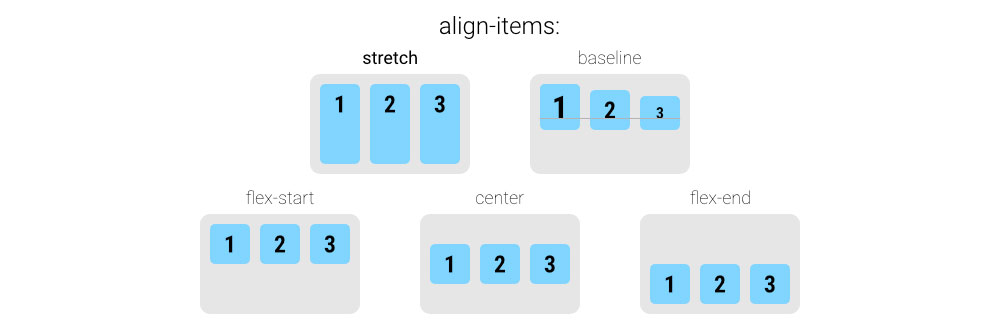
align-items ကတော့ ကိုယ်ရွေးချယ်ထားတဲ့ flex-direction ရဲ့ cross-axis ပေါ် မူတည်ပြီး component တွေကို နေရာချထားပါတယ်။ align-items မှာတော့ flex-start, flex-end, center, baseline နဲ့ stretch ဆိုပြီး value တွေ ရှိပါတယ်။
ညီမ အပေါ်မှာပြောခဲ့တဲ့ flex-wrap, flex-direction, justify-content, align-content နဲ့ align-center ကတော့ parent component မှာ ရေးသားရမည့် properties တွေ ဖြစ်ပါတယ်။
align-self ကတော့ child component တစ်ခုချင်းကို သီးခြား နေရာချထားချင်တဲ့အချိန်မှာ အသုံးပြုပါတယ်။ “align-self” property ကို ကိုယ်သီးခြား ပြောင်းချင်တဲ့ child component မှာ ရေးသားရမှာ ဖြစ်ပါတယ်။ align-self မှာတော့ flex-start, flex-end, center, baseline, stretch နဲ့ auto ဆိုပြီး value တွေ ရှိပါတယ်။

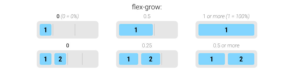
flex-grow ကတော့ parent component မှာ child component အသီးသီးကို ဘယ်လောက်ပမာဏ နေရာပေးမယ်ဆိုပြီး သတ်မှတ်တဲ့အခါ အသုံးပြုပါတယ်။ ဥပမာအနေနဲ့ flex-grow: 1; ဆိုပြီး child component အသီးသီးမှာ ရေးသားထားမယ်ဆိုရင် child-component တွေက ညီတူညီမျှ parent component မှာ နေရာယူသွားမှာ ဖြစ်ပါတယ်။ child component 3 ခု ရှိတဲ့အခါမှာ ပထမတစ်ခုကို flex-grow: 1, ဒုတိယတစ်ခုကို flex-grow: 2, တတိယတစ်ခုကို flex-grow: 3; ပေးမယ်ဆို ပထမ child component က parent component ရဲ့ 1/6 ကို နေရာယူမယ်၊ ဒုတိယ child component က parent component ရဲ့ 2/6 ကို နေရာယူမယ်၊ တတိယတစ်ခုကတော့ 3/6 ကို နေရာယူသွားမှာ ဖြစ်ပါတယ်။
ဒီနေ့ ညီမ မျှဝေပေးခဲ့ flexbox properties တွေကို လေ့လာပြီး အကျိုးရှိသွားမယ်လို့ မျှော်လင့်ပါတယ်ရှင့်။ အချိန်ပေး ဖတ်ရှုပေးတဲ့အတွက် ကျေးဇူးတင်ပါတယ်။
