ညီမကတော့ Spiceworks myanmar company မှာ Web Designer အဖြစ်ဝင်ရောက်လုပ်ကိုင်နေတဲ့ မဆုရည်ထွန်း ဖြစ်ပါတယ်။ ဒီအပတ်မှာတော့ CSS3 နဲ့ ပတ်သက်ပြီး Web Developerနှင့် Web Designer တွေအတွက် css coding ရေးရာမှာ အထောက်ကူဖြစ်စေမည့် CSS coding knowledge လေးတွေကိုညီမလေ့လာထားသလောက်လေး sharing လုပ်ပေးချင်ပါတယ်။CSS3 နဲ့ ပတ်သက်ပြီး
1. Browser Define
2. CSS transition
3. RGBA background
4. Border radius
5. @font-Face
6. CSS gradient
7. Text Rotate
8. CSS animation
9. Text shadow
10. Box shadow
စတဲ့ အကြောင်းအရာခေါင်းစဉ် ၁၀ ခု ကို အပိုင်း နှစ်ပိုင်းခွဲပီး ပြောပြ ပေးမှာဖြစ်ပါတယ်။
1.Browser Define
CSS code တွေရေးတဲ့အချိန် Browser တွေမတူတာကြောင့် ကိုယ်ရေးလိုက်တဲ့ css code က မှန်ပင်မဲ့ အလုပ်မလုပ်တဲ့Error တွေရှိတတ်ပါတယ်။အဲ့လိုError တွေ မရှိအောင် CSS browser Define သတ်မှတ်ပုံလေးပြောပြချင်ပါတယ်။
ပုံမှန် CSS coding ရေးမယ်ဆိုရင်
transition: all linear 2s;/* standard Code*/
ဆိုပီးရေးပေးရပါတယ်။
Safari နဲ့ Chrome Browser တွေမှာအလုပ်လုပ်စေချင်ရင် keyword -webkit- ကိုသုံးပေးရမှာဖြစ်ပါတယ်။
-webkit-transition: all linear 2s;
Firefox Browser မှာအလုပ်လုပ်စေချင်ရင် keyword -moz- ကိုသုံးပေးရမှာဖြစ်ပါတယ်။
-moz-transition: all linear 2s;
Opera browser မှာအလုပ်လုပ်စေချင်ရင် keyword -o- ကိုသုံးပေးရမှာဖြစ်ပါတယ်။
-o-transition: all linear 2s;
IE Browser မှာအလုပ်လုပ်စေချင်ရင် keyword -ms- ကိုသုံးပေးရမှာဖြစ်ပါတယ်။
-ms-transition: all linear 2s;
စသည်ဖြင့်သတ်မှတ်ပေးရမှာဖြစ်ပါတယ်။
2.CSS3 Transition
CSS transition ကိုတော့ CSS property values တွေ ကို အချိန်တစ်ခု သတ်မှတ်ပြီး value တစ်ခုနဲ့ တစ်ခု အပြောင်းအလဲ လုပ်ချင်တဲ့အခါမှာသုံးပါတယ်။
2.1 How to use CSS3 Transitions
CSS3 Transition effect ဖန်တီးမယ်ဆိုရင်
- ကိုယ် effect ထည့်ချင်တဲ့ CSS property
- Css transition effect သက်ရောက်မဲ့ကြာချိန်
သတိပြုရမဲ့အချက်ကတော့ Transition Effect တစ်ခုရေးတိုင်း Transition Duation သတ်မှတ်ပေးရမှာဖြစ်ပါတယ်။Transition duation ရဲ့ Default Value က 0 ဖြစ်နေလို့ပါ။
2.2 Specify the Speed Curve of the Transition
The transition-timing-function property ကတော့ CSS property ကို effect သက်ရောက်မဲ့ Styleပဲဖြစ်ပါတယ်။
The transition-timing-function property can have the following values:
- ease – specifies a transition effect with a slow start, then fast, then end slowly(this is default)
- linear – specifies a transition effect with the same speed from start to end
- ese-in – specifies a transition effect with a slow start
- ease-out – specifies a transition effect with a slow end
- ease-in-out – specifies a transition effect with a slow start and end
- cubic-bezier(n,n,n,n)– lets you define your own values in a cubic-bezier function
Example:
div{
-webkit-transition-timing-function: linear;
-moz-transition-timing-function: linear;
-ms-transition-timing-function: linear;
-o-transition-timing-function: linear;
 transition-timing-function: linear;
}
ညီမက example ဘယ်လိုရေးရမလဲဆိုတာပဲပြပေးတာပါ။ကိုယ်ကိုယ်တိုင် နောက်ထပ် stlye လေးတွေထည့်သုံးပီးစမ်းကြည့်ပါနော်။
2.3 CSS Transition delay
CSS tansition ကို effect မသက်ရောက်ခင် delay ဆိုတဲ့ အချိန်လဲသတ်မှတ်ပေးလို့ရပါတယ်။
Example
.delay{
width: 100px;
height: 100px;
background: red;
-webkit-transition: all 2s linear 3s;
-moz-transition: all 2s linear 3s;
-ms-transition: all 2s linear 3s;
-o-transition: all 2s linear 3s;
transition: all 2s linear 3s;
}
.delay:hover{
	width: 200px;
}
Example အတိုင်းဆိုရင် delay ဆိုတဲ့ css class ကို hover ထောက်ရင် delay time:3s ပေးထားတဲ့အတွက် 3s ကြာပီးမှသာ width 200px ကိုပြောင်းသွားမှာဖြစ်ပါတယ်။
2.4 CSS Transition + Transform
CSS transition ကို tansform နဲ့ပေါင်းပီး CSS property တွေကို effect ပြောင်းလို့ရပါသေးတယ်။
Example:
div {
width: 100px;
height: 100px;
background: red;
-webkit-transition: all 2s linear 2s; -webkit-transform: 1s;
-moz-transition: all 2s linear 2s;    -moz-transform: 1s;
-ms-transition: all 2s linear 2s;     -ms-transform: 1s;
-o-transition: all 2s linear 2s;      -o-transform: 1s;
 transition: all 2s linear 2s;         transform: 1s;
}
div:hover{
width: 300px;
height: 300px;
-webkit-transform: rotate(180deg);
-moz-transform: rotate(180deg);
-ms-transform: rotate(180deg);
-o-transform: rotate(180deg);
 transform: rotate(180deg);
}
width:100px; height:100px; ရှိတဲ့ div တစ်ခုကိုhover ထောက်လိုက်တာနဲ့ CSS tansition နဲ့ transform effect သက်ရောက်ပုံလေးပါ။
CSS Transition ရဲ့နောက်ဆုံးအနေ နဲ့ CSS transition သတ်မှတ်ပုံလေးတွေ ပြောပြပေးမှာပါ။
Example
div {
transition-property: width;
transition-duration: 2s;
transition-timing-function: linear;
transition-delay: 1s;
}
OR
div {
transition: width 2s linear 1s;
}
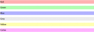
3.RGBA background
RGBA color value ကတော့ rgba(red,green,blue,alpha) ပဲဖြစ်ပါတယ်။
RGBA color values က RGB(red,green,blue) color values တွေကို alpha နဲ့ ထပ်ပေါင်းပီး color ပြောင်းတာဖြစ်ပါတယ်။alpha ဆိုတာက တော့ color တန်ဖိုးတွေကို opicity နဲ့ ထည့်တာဖြစ်ပါတယ်။ alpha တန်ဖိုး သတ်မှတ်ရင်တော့ 0 နဲ့ 1ကြားတန်ဖိုးတွေသတ်မှတ်ပေးရမှာပါ။
Example
#p1 {background-color:rgba(255,0,0,0.3);}
#p2 {background-color:rgba(0,255,0,0.3);}
#p3 {background-color:rgba(0,0,255,0.3);}
#p4 {background-color:rgba(192,192,192,0.3);}
#p5 {background-color:rgba(255,255,0,0.3);}
#p6 {background-color:rgba(255,0,255,0.3);}
4.Border Radius
Border Radius က button တွေ မှာ ဖြစ်ဖြစ်၊ boder line ထည့်တဲ့အချိန် ထောင့်တွေကို ကွေးတဲ့အခါမှာအသုံးပြုပါတယ်။
Border Radius value သတ်မှတ်ပုံ က ၄နည်းရှိပါတယ်။
- Four values: first value applies to top-left, second value applies to top-right, third value applies to bottom-right, and fourth value applies to bottom-left corner
- Three values: first value applies to top-left, second value applies to top-right and bottom-left, and third value applies to bottom-right
- Two values: first value applies to top-left and bottom-right corner, and the second value applies to top-right and bottom-left corner
- One value: all four corners are rounded equally
Example:
1.Border Radius With One Values
div {
border: 1px solid red;
padding: 10px;
background-color: blue;
border-radius: 25px;
-moz-border-radius: 25px;
-webkit-border-radius: 25px;
border-color: #000;
}
1.Border Radius With One Values
2.Border Radius With Four Values
div {
border: 1px solid red;
padding: 10px;
background-color: blue;
border-radius: 15px 50px 30px 5px;
-moz-border-radius: 15px 50px 30px 5px;
-webkit-border-radius: 15px 50px 30px 5px;
}
1.Border Radius With Four Values
3.Border Radius With Three Values
div {
border: 1px solid red;
padding: 10px;
background-color: blue;
border-radius: 15px 50px 30px ;
-moz-border-radius: 15px 50px 30px ;
-webkit-border-radius: 15px 50px 30px ;
}
1.Border Radius With three Values
4.Border Radius With Two Values
div {
border: 1px solid red;
padding: 10px;
background-color: blue;
border-radius: 15px 50px ;
-moz-border-radius: 15px 50px ;
-webkit-border-radius: 15px 50px ;
}
1.Border Radius With two Values
border radius ကို border:50px solid red; အနေ နဲ့ value ပေးလိုက်ရင် စက်ဝိုင်းပုံစံ ရရှိမှာဖြစ်ပါတယ်။စမ်းကြည့်ပေးပါအုန်းနော်။
5.@Font Face
computer ထဲ မှာ font မရှိရင် တောင် @font Face ကိုသုံးပြီး လိုချင်တဲ့ font ကို လိုသလိုအသုံးပြုနိုင်မှာဖြစ်ပါတယ်။
Different @Font Face
- TrueType Fonts (TTF)
for both the Mac OS and Microsoft Windows operating systems. - OpenType Fonts (OTF)
for scalable computer fonts - The Web Open Font Format (WOFF)
for use in web pages. - The Web Open Font Format (WOFF 2.0)
that provides better compression than WOFF 1.0. - SVG Fonts/Shapes
to be used as glyphs when displaying text. - Embedded OpenType Fonts (EOT)
use as embedded fonts on web pages.
How to Use @Font Face
Example:
@font-face {
font-family: myFirstFont;
src: url(sansation_light.woff);
}
div {
  font-family: myFirstFont;
}
နောက် တစ်ပါတ်မှာ ကျန်တဲ့ အကြောင်းအရာတွေ ထပ်ရေးပေးပါ့မယ်နော်။
အားလုံးကိုကျေးဇူးတင်ပါတယ်ရှင့်။
Reference Link: www.w3school.com
