အားလုံးပဲ မင်္ဂလာပါခင်ဗျ။
ကျွန်တော်ကတော့ Spiceworks Myanmar Company တွင် Web Designer အဖြစ် ဝင်ရောက် အလုပ်လုပ်ကိုင်နေတဲ့ ကျော်စိုးနိုင် ဖြစ်ပါတယ်ခင်ဗျ။
ဒီတစ်ပတ်မှာတော့ web development တွင် အသုံးများနေသော bootstrap 5 အကြောင်းကို ကျွန်တော် လေ့လာရသလောက် ရှင်းလင်းရေးသားဖော်ပြပေးသွားမှာဖြစ်ပါတယ်။
Bootstrap ဆိုတာဘာလဲ?
Free front-end framework ဖြစ်ပြီးတော့ website နှင့် web app တွေကို လွယ်ကူလျင်မြန်စွာ development လုပ်နိုင်သော framework တစ်ခုဖြစ်ပါတယ်။
Bootstrap ကတော့ Website နှင့် Web app တွေမှာ popular ဖြစ်တဲ့ framework တစ်ခုဖြစ်ပြီး web development ပိုင်းမှာ အသုံးများတဲ့ typography, forms, buttons, tables, navigation, modals, image နှင့် carousel စတဲ့ ပုံဖော် ရေးသားမှုတွေကို desktop, tablet, mobile device (၃)မျိုး တို့မှာ အဆင်ပြေစေရန် HTML, CSS, Javascript plugins options တွေနဲ့ အခြေခံ ပြုလုပ်ဖန်တီးထားတဲ့ framework ဖြစ်ပါတယ်။
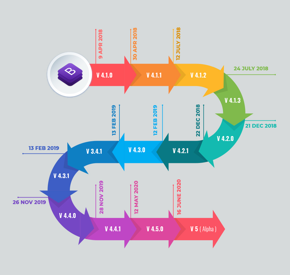
Bootstrap 5 ကို ၂၀၂၀ခုနှစ်၊ ဇွန်လ၊ (၁၆)ရက် နေ့မှာ release လုပ်နိုင်ခဲ့ပြီး၊ ကြာချိန်အားဖြင့် (၂)နှစ်နီးပါး ကြာခဲ့ပါတယ်။
Bootstrap 5 ထုတ်ပြန်မှုအား အသေးစိတ်ကြည့်ရှုလိုပါက အောက်ပါ Link တွင် ကြည့်ရှုနိုင်ပါတယ်။
https://www.bootstrapdash.com/blog/bootstrap-5-released
Bootstrap 5 Timeline
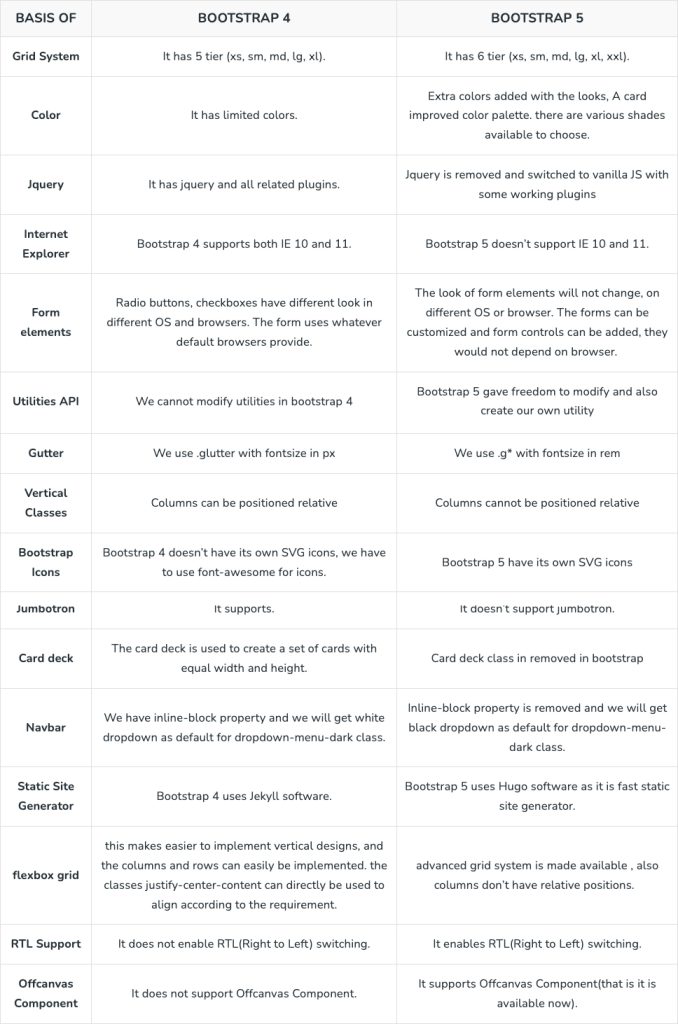
Bootstrap 4 နှင့် Bootstrap 5 ခြားနားချက်များ
Bootstrap 4 နှင့် အသစ်ထွက်ရှိလာသော bootstrap 5 ခြားနားချက်မျာကို အောက်ပါ ပုံမှာ ဖတ်ရှုနိုင်ပါတယ်။
How to use Bootstrap CDN
Bootstrap 5 အား အောက်ပါ CDN link ကို ချိတ်ဆက် အသုံးပြုနိုင်ပါတယ်။
https://cdn.jsdelivr.net/npm/bootstrap@5.3.2/dist/css/bootstrap.min.css
https://cdn.jsdelivr.net/npm/bootstrap@5.3.2/dist/js/bootstrap.bundle.min.js
How to install Bootstrap 5
Project တစ်ခု အတွင်းမှာ cdn link ကို အသုံးမပြုချင်ပါက “npm init bootstrap” ဆိုတဲ့ command ကိုအသုံးပြုပေးရမှာ ဖြစ်ပါတယ်။
npm init bootstrap
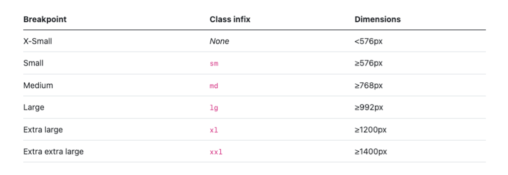
Bootstrap 5 Breakpoint
Bootstrap 4 မှာဆိုရင် default breakpoint အနေဖြင့် breakpoint (၅)ခု ပါဝင်ခဲ့ပြီး Bootstrap 5 မှာဆိုရင် breakpoint (၆)ခု ပါဝင်လာပါတယ်။ Extra extra large ဆိုတဲ့ xxl အဖြစ် media query ≥1400px နှင့် အထက်ဖြစ်ပါတယ်။
Bootstrap Layout
Container-Fluid & Container
Bootstrap default grid system ကို အသုံးပြုရာတွင် container class သည် အဓိက အခြေခံအကျဆုံးသော layout element ဖြစ်ပါတယ်။ Responsive ရေးသားရာမှာ container fluid နှင့် container ဆိုပြီးနှစ်မျိုးသတ်မှတ်ထားပါတယ်။
1 .container-fluid
Window width အတွင်း နေရာအပြည့်ယူရေးသားချက်အတွက်အသုံးပြုဖို့အတွက် သတ်မှတ်ထားခြင်းဖြစ်ပါတယ်။
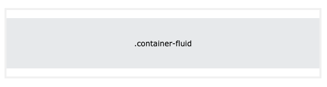
.container-fluid
2 .container
Window width အတွင်း breakpoint တစ်ခုချင်းစီတွင် max-width ထိန်းပြီး ရေးသားရာမှာ container ဆိုပြီး သတ်မှတ်ထားခြင်းဖြစ်ပါတယ်။
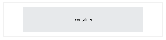
.container
Bootstrap 5 Grid System
Bootstrap ကို column ၁၂ခုဖြင့် grid ဖွဲ့ထားပါတယ်။ column များအား အောက်ပါအတိုင်း သတ်မှတ်ပြီး grid ၁၂ခုခွဲနိုင်ပါတယ်။
.col-1, .col-2, .col-3, .col-4, .col-5, .col-6, .col-7, .col-8, .col-9, .col-10, .col-11, .col-12
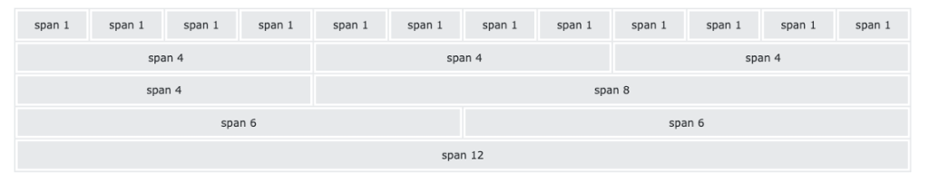
Bootstrap 5 grid system မှာဆိုရင် class (6)မျိုးရှိပါတယ်။
• .col- (extra small devices – screen width less than 576px)
• .col-sm- (small devices – screen width equal to or greater than 576px)
• .col-md- (medium devices – screen width equal to or greater than 768px)
• .col-lg- (large devices – screen width equal to or greater than 992px)
• .col-xl- (xlarge devices – screen width equal to or greater than 1200px)
• .col-xxl- (xxlarge devices – screen width equal to or greater than 1400px)
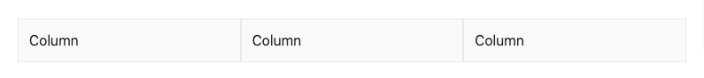
col ခွဲရာတွင် row ခြုံပြီး အောက်ပါအတိုင်းခွဲရပါမည်။
ColumnColumnColumn
Bootstrap 5 Text / Typography
Bootstrap Element <p> tag မှာဆိုရင် default font-size ကို 1rem (16px) သတ်မှတ်ထားပြီး line-height 1.5, margin-top: 0 နှင့် margin-bottom: 1rem (16px) default ပါဝင်ပါတယ်။
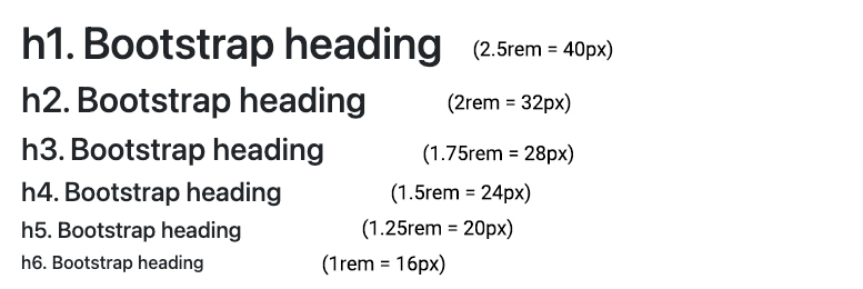
Heading
Heading အတွက် h1 to h6 ထိသတ်မှတ်ထားပြီး h1 မှာဆိုရင် default font-size 2.5rem (40px) သတ်မှတ်ထားပါတယ်။ h1 to h6 font-size သတ်မှတ်ချက်ကို အောက်ပါ ပုံမှာလေ့လာကြည့်နိုင်ပါတယ်။
Display Heading
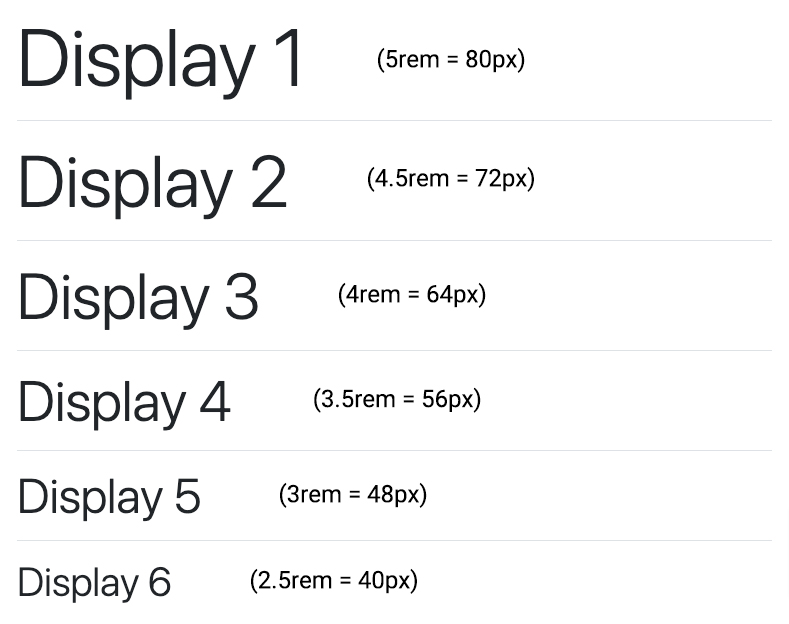
Heading text ထက်ကြီးသော font-size တွေအတွက်ဆိုရင် display heading ကိုအသုံးပြုနိုင်ပါတယ်။ Display Heading မှာဆိုရင်လည်း .display-1 to .display-6 ထိသတ်မှတ်ထားပါတယ်။
.display-6 ရဲ့ font-size ကတော့ h1 font-size 2.5rem (40px) နှင့်ညီမျှပါတယ်။
.display-1 to .display-6 font-size သတ်မှတ်ချက်ကို အောက်ပါပုံမှာ လေ့လာကြည့်နိုင်ပါတယ်။
Bootstrap 5 images
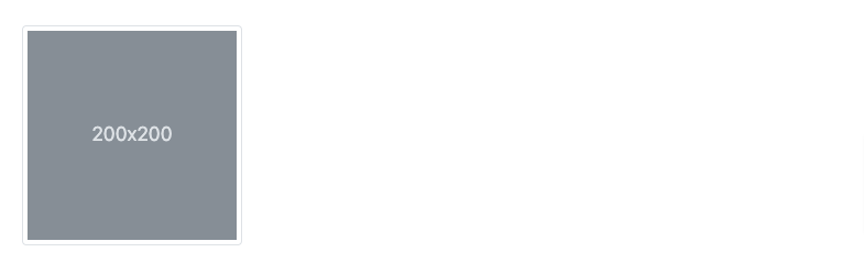
Bootstrap images များအတွက် responsive ပုံစံကို ပြုလုပ်နိုင်ရန်အတွက် .img-fluid ဆိုပြီး ပါဝင်ပါတယ်။အောက်ပါပုံစံအတိုင်း .img-fluid ကို တည်ဆောက်အသုံးပြုနိုင်ပါသည်။

Bootstrap တွင် ပါရှိသော .img-thumbnail ကိုတော့ rounded 1px border ပါရှိသော images များကို ဖန်တီးနိုင်ရန် သတ်မှတ်ထားပါတယ်။
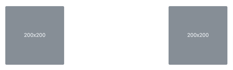
Aligning images
Bootstrap images များရဲ့ alignment အား float element များကို အသုံးပြုပြီး အောက်ပါအတိုင်းချိန်ဆနိုင်ပါသည်။

Display Property
Display property မှာဆိုရင် inline element နှင့် block element များအတွက် d-inline, d-block ဆိုပြီး အောက်ပါအတိုင်း အသုံးပြုနိုင်ပါတယ်။

d-inlined-inline
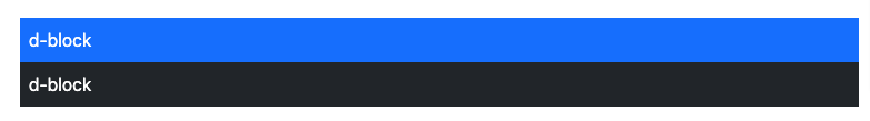
d-block
d-block
Element များကို hide လုပ်ပြီး အသုံးပြုနိုင်ရန်အတွက် d-none element များကို breakpoint ပေါ်မူတည်ပြီး အောက်ပါပုံအတိုင်း အသုံးပြုနိုင်ပါတယ်။
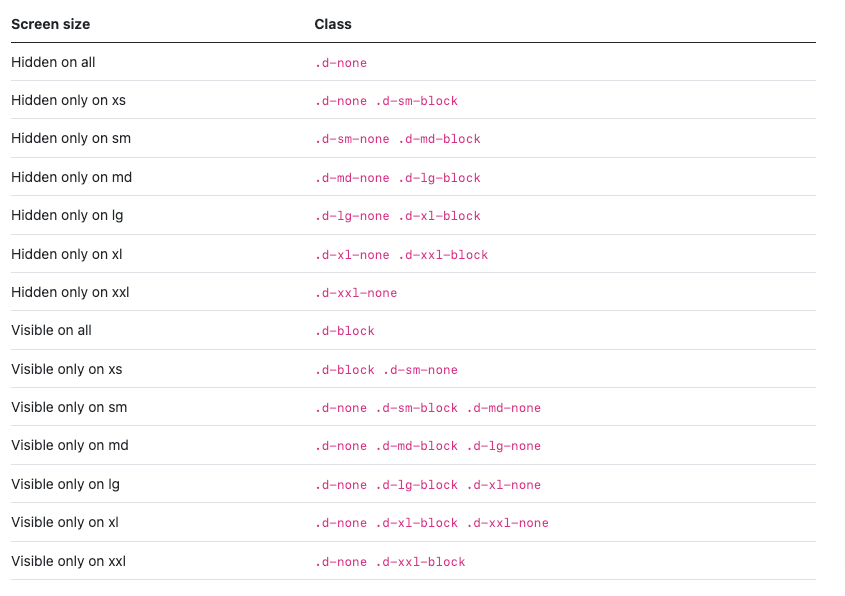
hide on lg and wider screenshide on screens smaller than lg
အထက်ပါ ပုံစံအတိုင်း သက်ဆိုင်ရာ class များထည့်သွင်းပြီး မိမိအလိုရှိသော layout, design များအား Bootstrap 5 အသုံးပြုပြီး website နှင့် web app များကို အချိန်မြန်လွယ်ကူစွာ ပြုလုပ်နိုင်မည်ဖြစ်ပါတယ်။ Bootstrap 5 အသုံးပြုပုံနဲ့ပတ်သက်ပြီး ဗဟုသုတအနေနဲ့ အနည်းငယ်ရရှိသွားလိမ့်မယ်လို့ မျှော်လင့်ပါတယ်။
အောက်ပါမူရင်း site မှလည်း လေ့လာနိုင်ပါတယ်။
https://getbootstrap.com/docs/5.0/getting-started/introduction/
အဆုံးထိ အချိန်ပေးပြီး ဖတ်ရှုပေးခဲ့ကြတဲ့အတွက် ကျေးဇူးတင်ပါတယ်ခင်ဗျ။
