အားလုံးပဲ မင်္ဂလာပါရှင့်။
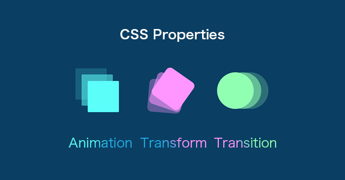
ညီမကတော့ Spiceworks Myanmar မှာ Web Designer အနေနဲ့ ဝင်ရောက်လုပ်ကိုင်နေတဲ့ ခင်ရတနာအောင် ဖြစ်ပါတယ်ရှင့်။ ဒီတစ်ပတ် ညီမ မျှဝေပေးချင်တဲ့ အကြောင်းအရာကတော့ CSS properties တွေဖြစ်တဲ့ animation, transform, transition တို့ပဲ ဖြစ်ပါတယ်။ ဒီ CSS properties တွေကို အသုံးပြုပြီးတော့ လွယ်ကူရိုးရှင်းတဲ့ animation တွေ စတင်ဖန်တီးကြည့်လို့ရပါတယ်။
Animation
animation property က element ကို ပုံစံ တစ်ခုကနေ တစ်ခုကို တဖြည်းဖြည်း ပြောင်းလဲပေးပါတယ်။
animation နဲ့ ပတ်သက်ပြီး လေ့လာရမယ့် properties တွေကတော့ –
@keyframes
animation-name
animation-duration
animation-delay
animation-iteration-count
animation-direction
animation-timing-function
animation-fill-mode
animation တို့ပဲ ဖြစ်ပါတယ်။
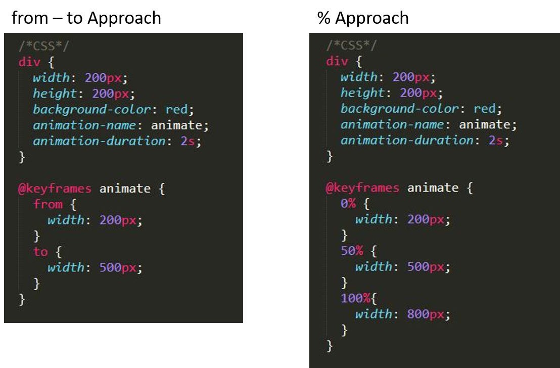
animation property ကို အသုံးပြုမယ်ဆိုရင် @keyframes animation-name ဆိုပြီး ကြေညာပြီးမှ အသုံးပြုရပါမယ်။ @keyframes ထဲမှာ element ကို ဘယ်ပုံစံကနေ ဘယ်ပုံစံ ပြောင်းလဲမယ်ဆိုပြီး သတ်မှတ်ပေးလို့ ရပါတယ်။ အဲ့လို သတ်မှတ်တဲ့နေရာမှာ from – to approach နဲ့ % approach ဆိုပြီး ပုံစံ(၂)မျိုး ရှိပါတယ်။
animation တစ်ခု အချိန် ဘယ်လောက်ကြာမယ်ဆိုတာကို animation-duration နဲ့ သတ်မှတ်ပါတယ်။
animation ကို အချိန်ဘယ်လောက်နေမှ စမယ်ဆိုတာ သတ်မှတ်တဲ့အခါ animation-delay ကို အသုံးပြုကြပါတယ်။
animation-count ကတော့ animation ကို ဘယ်နှစ်ကြိမ်ပြုလုပ်မလဲဆိုတာ သတ်မှတ်ပေးပါတယ်။
animation-direction ကတော့ animation ဖြစ်စဉ်ကို ဘယ်လိုအစီအစဉ်နဲ့ သွားမလဲဆိုတာ ဆုံးဖြတ်ပါတယ်။ animation-direction အတွက် အသုံးပြုလို့ရတဲ့ values (၄) ခု ရှိပါတယ်။ values တွေ ဘယ်လိုအလုပ်လုပ်လဲဆိုတာ ဥပမာနဲ့ ရှင်းပြပါမယ်။
animation အတွက် @keyframes ကို from-to approach နဲ့ ရေးထားတယ် ဆိုပါစို့
forwards က from – to ပုံစံအတိုင်း အလုပ်လုပ်ပါတယ်။
backwards က to – from ပုံစံအတိုင်း အလုပ်လုပ်ပါတယ်။
alternate ကတော့ from – to – from ပုံစံအတိုင်း အလုပ်လုပ်ပါတယ်။
alternate-reverse ကတော့ to-from-to ပုံစံအတိုင်း အလုပ်လုပ်ပါတယ်။
animation-timing-function ကတော့ animation တစ်ခုအတွင်း ဖြစ်ပေါ်မယ့် speed curve ကို သတ်မှတ်ပေးပါတယ်။ animation-timing-function မှာလည်း linear, ease, ease-in, ease-out, ease-in-out ဆိုပြီး ရှိပါတယ်။ ဘယ်လိုကွာခြားလဲဆိုတာ https://cubic-bezier.com/ မှာ လေ့လာကြည့်ရှုနိုင်ပြီး ကိုယ်နှစ်သက်သည့် speed curve တစ်ခု ဖန်တီးနိုင်ပါတယ်။
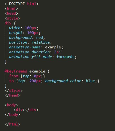
animation-fill-mode ကတော့ animation တစ်ခု မစတင်ခင် ဒါမှမဟုတ် ပြီးဆုံးသွားတဲ့အခါ element ကို ဘယ်လို style နဲ့ စတင်စေချင်လဲ ကျန်ရှိစေချင်လဲဆိုတာအတွက် အသုံးဝင်ပါတယ်။ coding အရ ကြည့်မယ်ဆို ပိုသိသာတဲ့အတွက် sample coding ထည့်ထားပေးပါတယ်။
Transform
transform က element တွေကို လှုပ်ရှားမှုမပါဘဲ ပုံပန်းသွင်ပြင်အရပြောင်းလဲပေးပါတယ်။ transform မှာ translate(), rotate(), scale() စတဲ့ method တွေကို အသုံးပြုပါတယ်။ translate() က element တွေကို x-axis/y-axis အတိုင်း နေရာရွေ့ဖို့ အသုံးပြုကြပါတယ်။ rotate() ကတော့ element တွေကို ကိုယ်ပေးတဲ့ degree အလိုက် လှည့်ပေးပါတယ်။ scale() ကို element တွေရဲ့ size အတိုးအလျော့ လုပ်ချင်တဲ့အခါ အသုံးပြုကြပါတယ်။
Transition
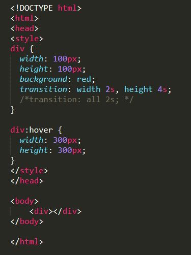
transition ကတော့ element တွေ state တစ်ခုကနေ တစ်ခုကို ပြောင်းလဲသွားတဲ့အခါမျိုးမှာ ပြောင်းလဲမှုကို smoothly ဖြစ်အောင် လုပ်ဆောင်ပေးပါတယ်။
*element တွေ state တစ်ခုကနေ တစ်ခု ပြောင်းတဲ့အချိန်မှာ ဖြစ်ပေါ်တဲ့ ပြောင်းလဲမှုတွေက တစ်ခုထက် ပိုမယ် ပြီးတော့ duration တူမယ်ဆိုရင် ပြောင်းလဲသွားတဲ့ properties တွေအစား all ဆိုပြီး ခြုံငုံရေးလို့ ရပါတယ်။
ဒီနေ့ ညီမ မျှဝေပေးခဲ့ CSS properties တွေကို လေ့လာပြီး အကျိုးရှိသွားမယ်လို့ မျှော်လင့်ပါတယ်ရှင့်။ အချိန်ပေး ဖတ်ရှုပေးတဲ့အတွက် ကျေးဇူးတင်ပါတယ်။
