
မင်္ဂလာပါခင်ဗျ။
ကျွန်တော်ကတော့ Spiceworks Myanmar ကုမ္ပဏီတွင် Web Designer အဖြစ် ဝင်ရောက် လုပ်ကိုင်လျက်ရှိသော ကျော်စိုးနိုင် ဖြစ်ပါတယ်။ ဒီတစ်ပတ်မှာတော့ CSS property တစ်ခုဖြစ်သော clip-path အကြောင်းကို မျှဝေပေးချင်ပါတယ်ခင်ဗျ။
What is clip-path?
clip-path ဆိုသည်မှာ ရုပ်ပုံတွေနဲ့ vector image format ဖြစ်သော SVG (scalable vector graphics) တွေကို လိုအပ်သလို clip လုပ်နိုင်ပြီး စိတ်ဝင်စားစရာကောင်းအောင် shape အမျိုးမျိုးကို ဖန်တီးနိုင်သော property ဖြစ်ပါတယ်။
Shape အမျိုးမျိုး create လုပ်နိုင်ရန် clip-path မှာ value အနေနဲ့ basic shape ( ၄) မျိုးဖြင့် သတ်မှတ်ထားပါတယ်။ Basic shapes ( ၄) မျိုးကတော့
1.polygon
2.ellipse
3.circle နှင့်
4.inset
တို့ဘဲဖြစ်ပါတယ်။
1.Polygon
Polygon ကို အသုံးပြုမည်ဆိုရင် flexible ဖြစ်သော shape အမျိုးမျိုးကို point များသတ်မှတ်ပြီး အသုံးပြုနိုင်ပါတယ်။ Points များက svg path နဲ့တူပြီး point များကို editing လုပ်မည်ဆိုရင် svg ပုံကို sublime text editor မှာထည့်ပြီး points များကို edit လုပ်နိုင်ပါတယ်ခင်ဗျ။ Polygon မှဆိုရင် support လုပ်ပေးနိုင်သော point အနေဖြင့် X coordinate နှင့် Y coordinate ဆိုပြီး တစ်ခုအနေဖြင့် အသုံးပြုနိုင်ပါသည်။ Example အနေဖြင့် Triangle Shape တစ်ခုကို clip-path တန်ဖိုးဖြစ်တဲ့ polygon ကို အသုံးပြုပြီး create လုပ်ထားပါတယ်ခင်ဗျ။
အောက်ပါပုံလေးကို ကြည့်ပြီး triangle shape လေးတစ်ခု create လုပ်နိုင်မှာဘဲဖြစ်ပါတယ်။
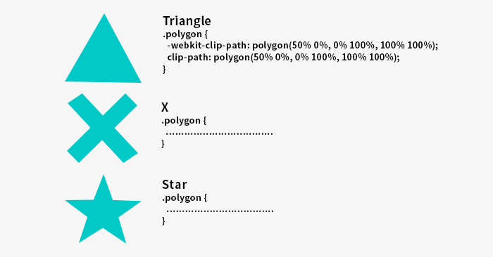
Triangle ကို create လုပ်ပြီး နားလည်ပြီဆိုရင်တော့ cross shape နှင့် star shape စတဲ့ shape အမျိုးမျိုးကိုလည်း create လုပ်နိုင်ပါသည်။
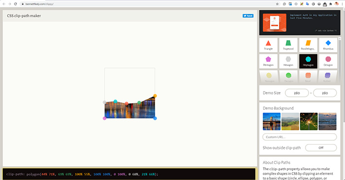
အောက်ပါ polygon maker link ကနေ တစ်ဆင့် shape အမျိုးမျိုးကို create လုပ်နိုင်ပါသည်။
https://bennettfeely.com/clippy/
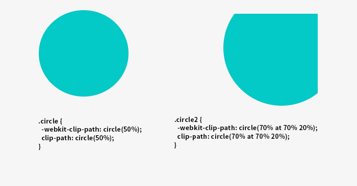
2.Circle
Circle ကတော့ရိုးရှင်းပြီး circle ဆိုသည်အတိုင်း radius ပေါ်အခြေခံပြီး shape များကို position X နှင့် position Y ဆိုပြီး သတ်မှတ်အသုံးပြုနိုင်ပါသည်။ Default တန်ဖိုးအနေဖြင့် position က optional ဖြစ်ပြီး radius 50% 50% ကိုအသုံးပြုနိုင်ပါတယ်။ Example အနေနဲ့ အောက်ပါပုံအတိုင်း create လုပ်ပြီးအသုံးပြုနိုင်ပါတယ်ခင်ဗျ။
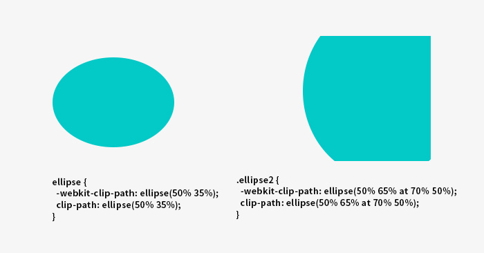
3.Ellipse
Eclipse မှာဆိုရင် syntax အနေနဲ့ radius X radius Y နှင့် position X position Y ဆိုပြီး အသုံးပြုနိုင်ပါသည်။Default အနေဖြင့် position တန်ဖိုးက optional ဖြစ်ပြီး circle နှင့်အတူတူ 50% 50% အသုံးပြုနိုင်ပါသည်။
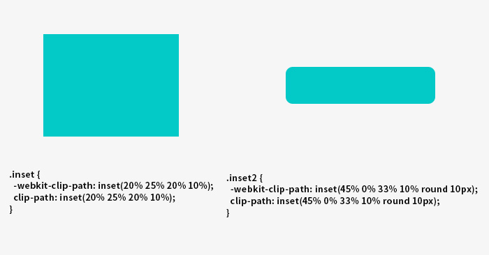
4.Inset
Inset ကိုတော့ အများအားဖြင့် rectangle ရဲ့ inner အပိုင်းနှင့် ပုံတွေကို crop လုပ်ပြီး ဖြတ်ထုတ်တဲ့ အပိုင်းမှာအသုံးပြုနိုင်ပါသည်။ Example အနေဖြင့်အောက်ပါတိုင်း create ပြီး အသုံးပြုနိုင်ပါတယ်ခင်ဗျ။
အခု clip-path ရဲ့ basic shape (၄) မျိုး အကြောင်းကိုလေ့လာသိရှိပြီးနောက် ကျွန်တော်က အသုံးများတဲ့ clip path အမျိုးအစား polygon နှင့် circle ကိုအသုံးပြုပြီး animation လေးပြုလုပ်ပုံအဆင့်ဆင့်ကို ရှင်းပြသွားပါမည်။
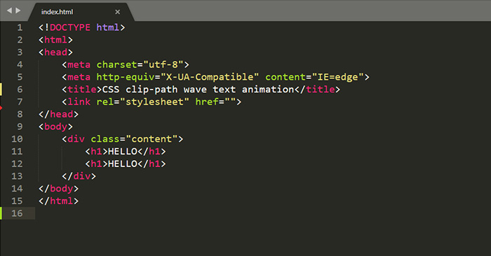
ပထမအဆင့်အနေနဲ့ ကျွန်တော်က HTML file တစ် file create လုပ်ပြီး Hello ဆိုတဲ့ Text လေးကို create လုပ်ထားပါတယ်ခင်ဗျ။
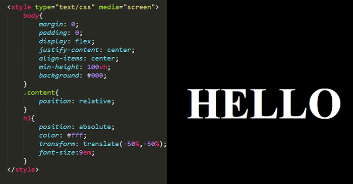
နောက်ပြီး text လေးကို လိုအပ်သော CSS လေးနဲ့ အလှဆင်ရေးသားထားပါမည်။
အခုဆိုရင် css နဲ့ create လုပ်ထားတဲ့ Hello ဆိုသော text လေးကိုမြင်ရမှာဖြစ်ပါတယ်။
အခု ဒီ “Hello” text လေးမှာ clip-path polygon animation လေးထည့်ဖို့အတွက် ပထမဆုံး clip-path maker တွင် မိမိလိုချင်သောပုံစံကို create လုပ်ပြီးနောက် ထိုပုံစံအတွက် point များကို ရရှိလာမည်ဖြစ်ပါသည်။ ဥပမာအားဖြင့် ကျွန်တော်ကတော့ အနိမ့်အမြင့်မတူသော wave ပုံစံနှစ်ခုကို create လုပ်ပါမည်။ ၎င်းနောက်တွင် wave ပုံစံနှစ်ခုအတွက် point များရရှိလာပါမည်။
ရရှိလာသော point များကို အသုံးပြုပြီး css animation @keyframe ထည့်ပြီး wave animation တစ်ခုကို အောက်ပါ code အတိုင်း ဆက်ရေးသွားပါမည်။
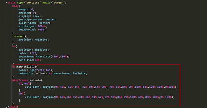
အခုဆိုရင် clip-path value polygon ကို အသုံးပြုပြီး အောက်ပါပုံအတိုင်း Polygon animation wave တစ်ခုကို မြင်ရပါလိမ့်မည်။

coding file အပြည့်အစုံကိုတော့ အောက်မှာ ဝင်ပြီး testing လုပ်လို့ရပါတယ်ခင်ဗျ။
		body{
			margin: 0;
			padding: 0;
			display: flex;
			justify-content: center;
			align-items: center;
			min-height: 100vh;
			background: #000;
		}
		.content{
			position: relative;
		}
		h1{
			position: absolute;
			color: #fff;
			transform: translate(-50%,-50%);
			font-size:9em;
		}
		h1:nth-child(2){
			color: rgb(7,218,165);
			animation: animate 4s ease-in-out infinite;
		}
		@keyframes animate{
			0%,100%{
				clip-path: polygon(0% 45%, 15% 44%, 32% 50%,54% 60%, 70% 61%,84% 59%,100% 52%,100% 100%,0%100%);
			}
			50%{
				clip-path: polygon(0% 60%,16% 65%,34% 66%,51% 62%,67% 50%,84% 59%,100% 46%,100% 100%,0% 100%);
			}
		}
HELLO
HELLO
နောက်တစ်ခု အသုံးများတဲ့ clip-path အမျိုးအစားကတော့ circle clip-path ဖြစ်ပါသည်။ circle clip-path hover effect ကိုလည်း အထက်မှာ create လုပ်ခဲ့သလို HTML နှင့် CSS ကိုအသုံးပြုပြီး circle hover effect တစ်ခုကို အောက်ပါ ပုံအတိုင်း လေ့လာပြီး create လုပ်နိုင်ပါတယ်ခင်ဗျ။ coding အပြည်အစုံကိုလည်း ဝင်ရောက်လေ့လာပြီး testing လုပ်လို့ရပါတယ်ခင်ဗျ။ 
Hi
Spiceworks Myanmar is the Japan & Myanmar joint web design and development company with clients around Japan.
body{
	background: #DCF5FF;
	margin: 0;
	height: 100vh;
	display: grid;
	justify-items:center;
	align-items:center;
	font-family: 'Roboto', sans-serif;
	font-weight: normal;

}
.inner{
	background: rgb(7,218,165);
	padding: 10px;
	border-radius: 10px;
	width: 300px;
	clip-path: circle(5% at 90% 20%);
	transition: .7s ease-in-out;
	cursor: pointer;
	position: relative;
	top: 0;

}
.inner:hover{
	clip-path: circle(75%);
	background: #00B6FF;
}
h1{
	color: white;
	margin: 0;
	font-size: 25px;
}
p{
	color: white;
	font-size: 18px;
}
clip-path အသုံးပြုချင်သူများအနေဖြင့် clip-path ကို အသုံးပြုမည်လို့စဉ်းစားမိလျှင်သိထားရမယ့် အချက်တစ်ခုလည်းရှိပါတယ်ခင်ဗျ။ clip-path css သည် browser support အနေဖြင့် 2020 မှာ အကုန်အလုပ်လုပ်နိုင်ပေမယ့်လည်း safari နဲ့ IE မှာတော့ support လုပ်ပေးနိုင်ရန် လိုအပ်နေဆဲဖြစ်ပါတယ်ခင်ဗျ။
အခုလို အချိန်ပေးပြီး ဂရုတစိုက်ဖတ်ရှုပေးတဲ့ အတွက် ကျေးဇူးတင်ပါတယ်ခင်ဗျ။
