မင်္ဂလာပါခင်ဗျ။
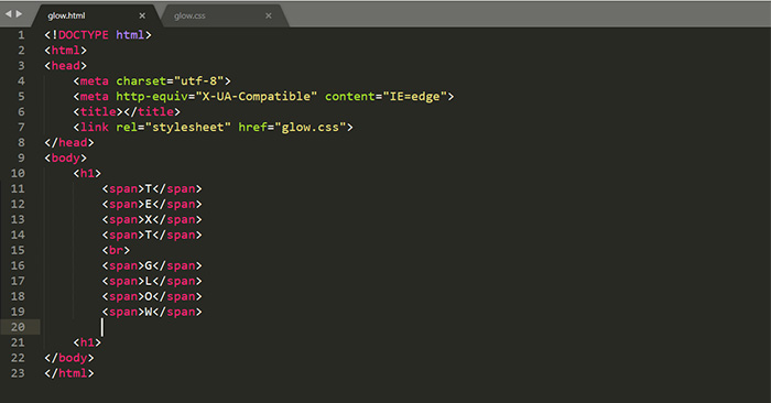
ကျွန်တော်ကတော့ Spiceworks Myanmar Company တွင် Web Designer အဖြစ် ဝင်ရောက်လုပ်ကိုင် လျက်ရှိသော ကျော်စိုးနိုင် ဖြစ်ပါတယ်။
ဒီတစ်ပတ်မှာတော့ CSS Animation ထဲမှ text Glow Animation အကြောင်း မျှဝေပေးချင်ပါတယ်ခင်ဗျ။ပထမဦးဆုံးအနေနဲ့ CSS Text Glow Animation ကို create ပြုလုပ်မယ်ဆိုရင် အသုံးဝင်သော CSS properties
နှစ်ခုကိုပြောပြချင်ပါတယ်ခင်ဗျ။ အဲဒီနှစ်ခုကတော့
1.Text Shadow
2.Filter
ဖြစ်ပါတယ်။
TEXT Shadow ဆိုသည်မှာ Text တွေကို နောက်ခံ shadow ထည့်ပြီး decoration လုပ်ရာမှာ အသုံးဝင်သော properties တစ်ခု ဖြစ်ပါတယ်။
Text shadow တစ်ခု create ပြုလုပ်မယ်ဆိုလျှင် value ၃ ခုဖြင့် ပေါင်းစပ်ဖန်တီးနိုင်ပါတယ်။
1. offsetX ,offsetY -text တစ်ခုရဲ့ Shadow Distance or Shadow length ကို သတ်မှတ်ပေးသော horizontal value offsetX နှင့် Vertical Value offset Y
2. Color – text တစ်ခုချင်းစီ၏ background shadow အရောင်ကို သတ်မှတ်ပေးပါတယ်။
3. blur-radius -shadowတစ်ခုကို ပိုပြီး wider ဖြစ်ချင်တဲ့အခါ ဒါမှမဟုတ် ပိုပြီး lighter ဖြစ်ချင်တဲ့အခါမျိုးမှာ သတ်မှတ်ပေးပါတယ်။
အောက်ဖော်ပြပါ အတိုင်း ရေးပေးလို့ရပါတယ်ခင်ဗျ။
/* offset-x | offset-y | blur-radius | color */

text-shadow: 1px 1px 2px black;


/* color | offset-x | offset-y | blur-radius */

text-shadow: #fc0 1px 0 10px;


/* offset-x | offset-y | color */

text-shadow: 5px 5px #558abb;


/* color | offset-x | offset-y */

text-shadow: white 2px 5px;


/*offset-x | offset-y /*

Use defaults for color and blur-radius */

text-shadow: 5px 10px;
တစ်ခုထက်မကတဲ့ shadow တွေကို create ပြုလုပ်တော့မယ်ဆိုရင် comma ဖြင့် separate လုပ်ပြီး အဆုံးမှာတော့ semicomma ဖြင့် အဆုံးသတ်ပြီး အသုံးပြု ဖန်တီးနိုင်ပါတယ်။
text-shadow: 0 0 10px #FA1C16,
0 0 30px #FA1C16,
0 0 100px #FA1C16,
0 0 100px #FA1C16,
0 0 40px #FED128,
30px 30px 10px #806914;
နောက်ထပ်properties တစ်ခုကတော့ Filter ဖြစ်ပါတယ်။Filter ကတော့ graphic effect တစ်ခုဖြစ်ပြီး blur နှင့် color shifting လုပ်ဆောင်ချက်တို့နှင့်တူညီပါတယ်။အများအားဖြင့် Filter ကို image rendering , background နှင့် border တို့ကို adjust လုပ်တဲ့အခါမှာ အသုံးပြုနိုင်ပါတယ်ခင်ဗျ။
Filter ကို အသုံးပြုမယ်ဆိုရင် filter ကို support လုပ်ပေးနိုင်တဲ့properties များစွာရှိပါတယ်။ အသုံးများသော properties အားဖြင့် blur, brightness, saturation, contrast, gray-scale, hue-rotate တို့ ဖြစ်ပါတယ်။
အောက်ဖော်ပြပါအတိုင်းအသုံးပြုပြီး ရေးသားနိုင်ပါတယ်ခင်ဗျ။
filter: blur(5px);
filter: brightness(0.4);
filter: contrast(200%);
filter: grayscale(50%);
filter: hue-rotate(90deg);
filter: opacity(25%);
filter: saturate(30%);
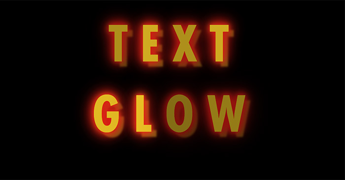
CSS properties နှစ်ခုုဖြစ်သော Text shadowနှင့် Filter ရဲ့ အသုံးပြုပုံကို သိရှိပြီး Text တစ်ခုကို Animation ဖြင့် အောက်ပါအတိုင်း decortion လုပ်နိုင်ပါတယ်ခင်ဗျ။
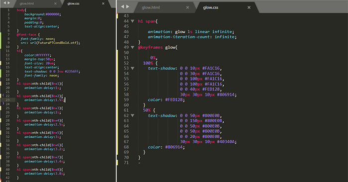
text decoration လုပ်ပြီးနောက်မှာပိုပြီး အသက်ဝင်လှုပ်ရှားလာစေရန်အတွက် Animation delay ကို adjust လုပ်ပြီး text glow Animation တစ်ခုကိုဖန်တီးနိုင်ပါတယ်။
Click Here >>>To View Text_Glow Animation
Text glow animation ကို အများအားဖြင့်Website တွေမှာ header ကို ပိုမို သိသာထင်ရှားစေရန်အတွက် အသုံးပြုတာကို မြင်တွေ့ရပါတယ်။ထို့အပြင်အစားအသောက်နှင့်ပတ်သက်ပြီး အစားအစာတွေကို advertise လုပ်တဲ့ နေရာမှာလဲ text glow animation ဖြစ်ဖန်တီး အသုံးပြုနိုင် ပါတယ်။အချိန်ပေးပြီး ဖတ်ရှုပေးတဲ့အတွက်ကျေးဇူးတင်ပါတယ်ခင်ဗျ။
