အားလုံးပဲ မင်္ဂလာပါ။
ညီမကတော့ Spiceworks Myanmar မှာ Web Designer အဖြစ် တာဝန်ယူလုပ်ကိုင်နေတဲ့ နီလာဌေး ဖြစ်ပါတယ်။ ဒီနေ့မှာတော့ CSS Properties တွေထဲကမှ Gradients နဲ့ Shadows တို့ရဲ့ အသုံးပြုပုံလေးကို ပြောပြပေးသွားမှာ ဖြစ်ပါတယ်။
CSS Gradients
အရောင်နှစ်ခု (သို့မဟုတ်) နှစ်ခုထက်ပိုသော အရောင်များကို ပေါင်းစပ်ပေးခြင်း ဖြစ်ပါတယ်။ Gradients type (၃) မျိုးရှိပါတယ်။
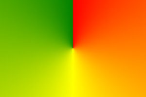
၁။ Linear Gradients
၂။ Radial Gradients
၃။ Conic Gradients
၁။ CSS Linear Gradients
အနည်းဆုံး color stops နှစ်ခုရှိရပါမယ်။
Syntax
background-image: linear-gradient(direction, color-stop1, color-stop2, ...);
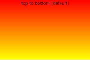
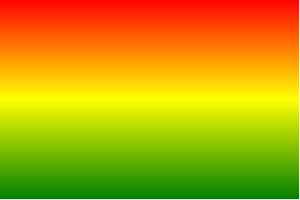
Direction – Top to Bottom (default)
background-image: linear-gradient(red, yellow);
Direction – Left to Right
background-image: linear-gradient(to right, red , yellow);
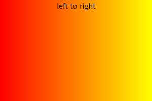
ကိုယ်လိုချင်သလို direction နဲ့ အရောင်ပါဝင်မှုကို percent နဲ့ ချိန်ညှိယူနိုင်ပါတယ်။
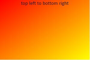
Direction – Diagonal
background-image: linear-gradient(to bottom right, red, yellow);
Using Angles
Direction တွေအစား angles တွေကိုလည်း အသုံးပြုလို့ရပါတယ်။ ဥပမာအနေနဲ့
0deg = to top
90deg = to right
180deg = to bottom အစရှိသဖြင့် ရှိပါတယ်။
Syntax
background-image: linear-gradient(angle, color-stop1, color-stop2);
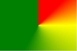
Using Multiple Color Stops
background-image: linear-gradient(red, yellow, green);
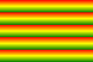
Repeating a linear-gradient
background-image: repeating-linear-gradient(red, yellow 10%, green 20%);
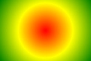
၂။ CSS Radial Gradients
Center ကနေ သတ်မှတ်ပြီး အနည်းဆုံး color stops နှစ်ခုရှိရပါမယ်။
Syntax
background-image: radial-gradient(shape size at position, start-color, ..., last-color);
Default အနေနဲ့ shape က ellipse ဖြစ်ပြီး position က center ဖြစ်ပါတယ်။
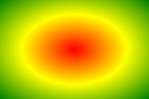
Radial Gradient – Evenly Spaced Color Stops (default)
background-image: radial-gradient(red, yellow, green);
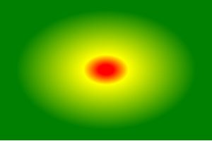
Radial Gradient – Differently Spaced Color Stops
background-image: radial-gradient(red 5%, yellow 15%, green 60%);
Set Shape
Shape ကို circle အနေနဲ့ သတ်မှတ်နိုင်ပါတယ်။
background-image: radial-gradient(circle, red, yellow, green);
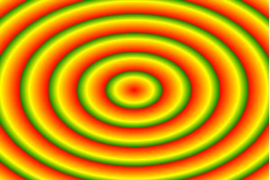
Repeating a radial-gradient
background-image: repeating-radial-gradient(red, yellow 10%, green 15%);
၃။ CSS Conic Gradients
Center အမှတ်ကနေ ဘေးပတ်လည် လှည့်ပတ်ထားသော အရောင်များဖြစ်ပြီး အနည်းဆုံး color stops နှစ်ခုရှိရပါမယ်။
Syntax
background-image: conic-gradient([from angle] [at position,] color [degree], color [degree], ...);
Default အနေနဲ့ angle က 0deg ဖြစ်ပြီး position က center ဖြစ်ပါတယ်။
Conic Gradient: Three Colors
background-image: conic-gradient(red, yellow, green);
Conic Gradient: Three Colors and Degrees
background-image: conic-gradient(red 45deg, yellow 90deg, green 210deg);
Create Pie Charts
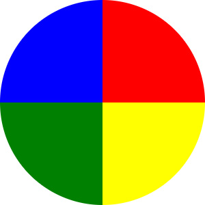
background-image: conic-gradient(red 0deg, red 90deg, yellow 90deg, yellow 180deg, green 180deg, green 270deg, blue 270deg, blue 360deg);
border-radius: 50%;
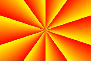
Repeating a Conic Gradient
background-image: repeating-conic-gradient(red 10%, yellow 20%);
CSS Shadow
Text နဲ့ element တွေမှာ shadow တွေ ထည့်နိုင်ပါတယ်။ Shadow type (၂) မျိုးရှိပါတယ်။
၁။ text-shadow
၂။ box-shadow
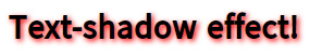
၁။ CSS Text Shadow
Text အတွက် အသုံးပြုပါတယ်။
Syntax
text-shadow: horizontal vertical blur color;
text-shadow: 2px 2px 5px red;
Multiple Shadows
Text မှာ shadow တစ်ခုထက်ပိုပြီး ထည့်လို့ရပါတယ်။ comma ခံပြီးထည့်နိုင်တယ်။
text-shadow: 0 0 3px #FF0000, 0 0 5px #0000FF;

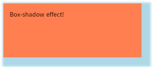
၂။ CSS Box Shadow
Element မှာ shadow တစ်ခု (သို့မဟုတ်) တစ်ခုထက်ပိုပြီး သုံးနိုင်တယ်။ Shadow ရဲ့ default color က လက်ရှိ text ရဲ့ color ဖြစ်ပါတယ်။
Syntax
box-shadow: horizontal vertical blur spread color;
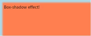
box-shadow: 10px 10px 5px 12px lightblue;
Set the inset Parameter
Inner shadow ထည့်ချင်တဲ့အခါမှာ သုံးပါတယ်။
box-shadow: 10px 10px 5px lightblue inset;
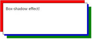
Multiple Shadows
box-shadow: 5px 5px blue, -10px -10px red, 15px 15px green;
ဒီနေ့တော့ ဒီလောက်နဲ့ပဲ အဆုံးသတ်လိုက်ပါတော့မယ်။ ဖတ်ကြည့်လို့ အကျိုးတစ်စုံတစ်ရာတစ်ခုခု ရသွားတယ်ဆိုရင်ပဲ ကျေနပ်ပါတယ်။ အားလုံးကို ကျေးဇူးတင်ပါတယ်။ နောက်ဘလော့ဂ်တွေမှာ ပြန်လည်ဆုံတွေ့ကြပါမယ်။
